More Fun With Graphs
I figured I'd post the latest graph magic from my work at Nucor-Yamato Steel. This is a graph of the entire network, switches AND hosts!
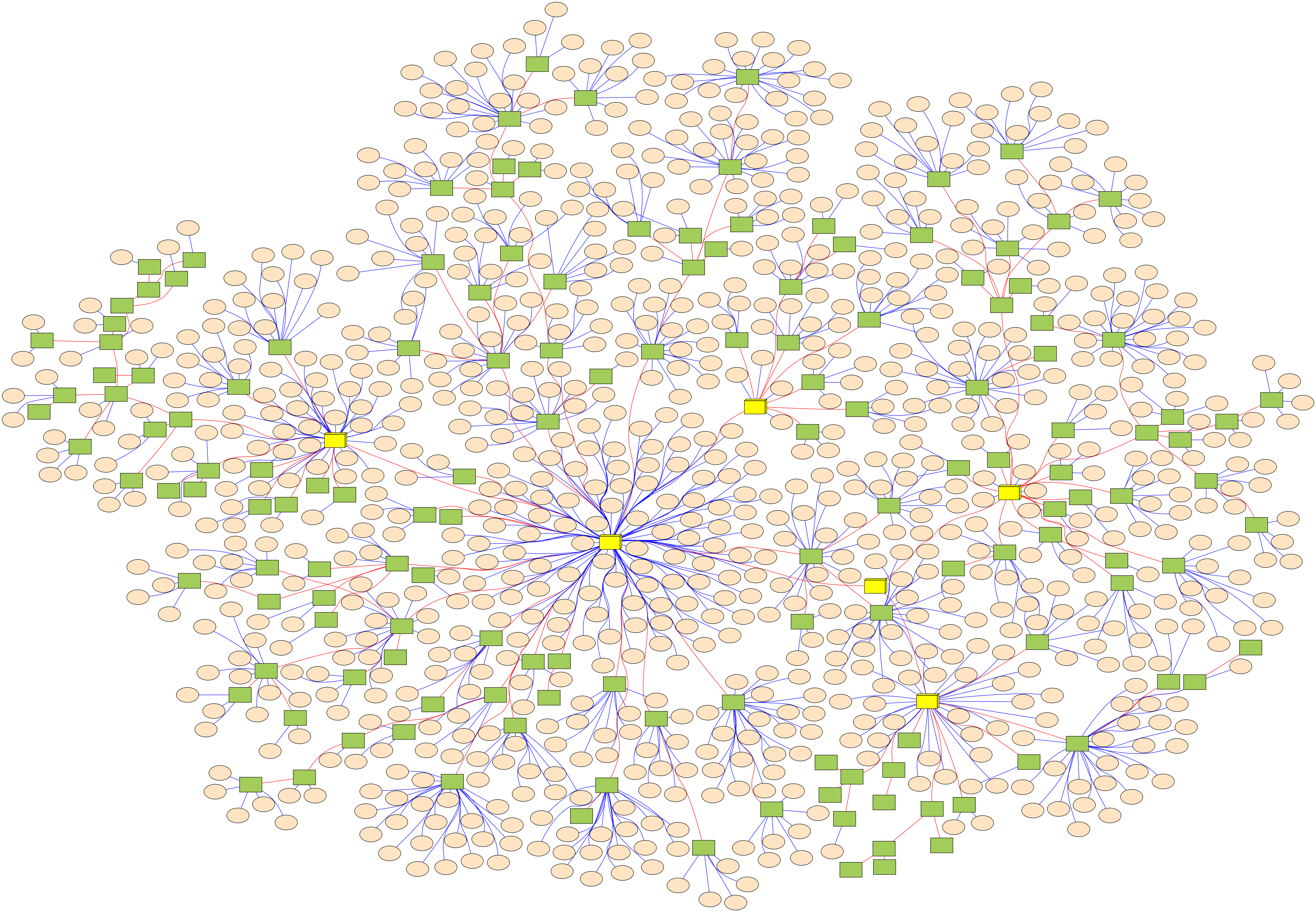
(click for full-sized version, warning: LARGE image)
Here, the yellow boxes are center switches/routers, the green boxes are switches, and the peach-colored nodes are hosts. Also, red lines are switch-to-switch connections and blue lines are switch-to-host connections.
Another somewhat off-topic thing about these graphs is that the manager of IT at Nucor-Yamato is interested in open-sourcing the code that manages all of the data and generates these graphs, AND let me use company time to work on and manage the project. If anyone knows of any open-source project (or software that doesn't cost an arm and a leg) that already does network discovery, data collection, and automated mapping then please let me know! If I'm not going to be re-inventing the wheel, then I'll probably be kicking the project off shortly after I start working full-time in June 2010.