Fun With Graphs
I've always been utterly fascinated with graph theory, mostly with its applications to networks. As an added bonus, they can be represented with pretty pictures!
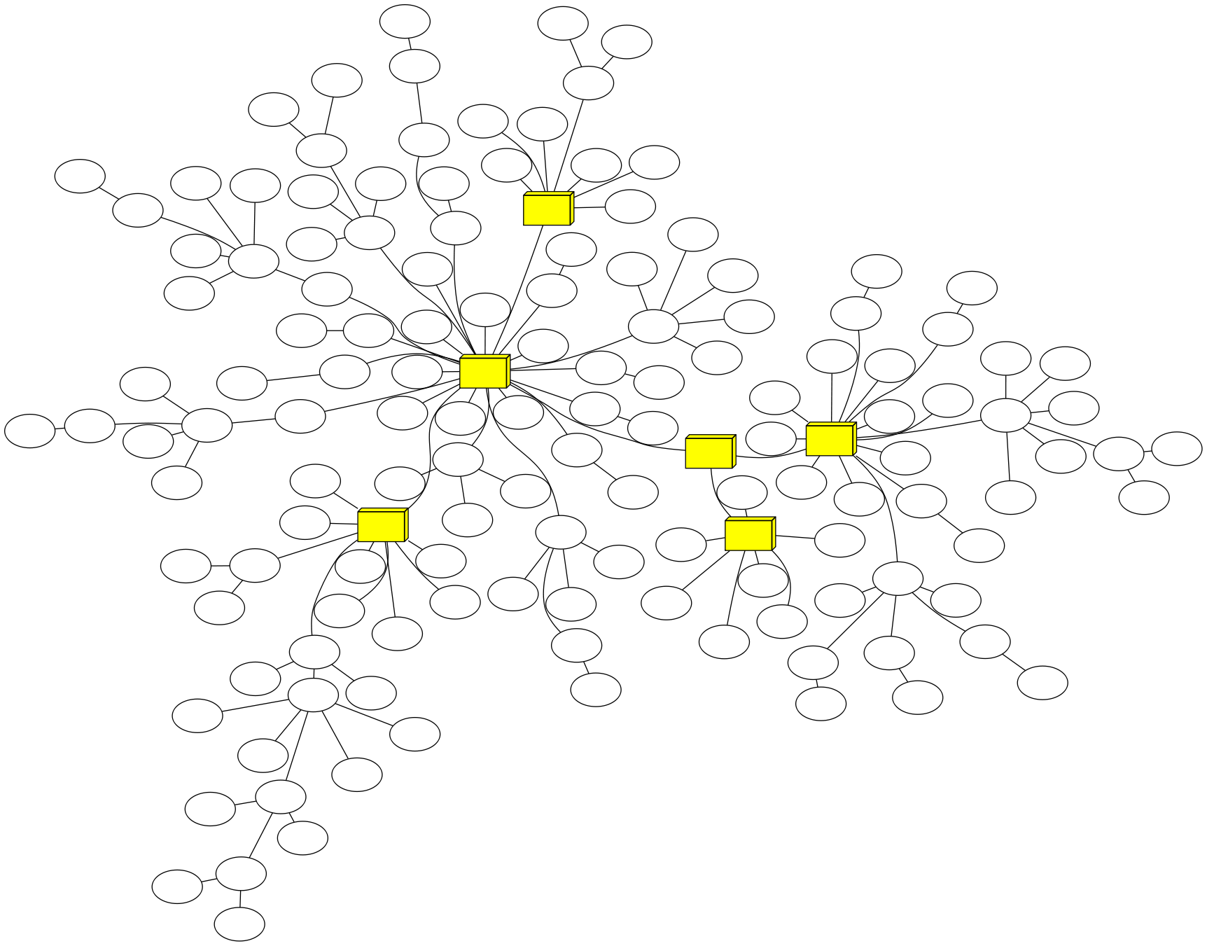 (click on image for full-sized version)
That graph represents the network behind Nucor-Yamato Steel and Nucor Castrip Arkansas, sanitized of sensitive information of course. All of the nodes are Cisco switches, the yellow boxes representing backbone switches (6500 series to be exact). This graph is part of the network information system that I've been working on during the majority of my internship at NYS and gets auto-generated every day, along with more centralized graphs on a per-switch basis. The way the system works is that a periodic Python script goes out to a list of known switches and gathers CDP neighbor information as well as the MAC address tables. Then Nmap scans are ran every 6 hours to scan for hosts, gathering IP addresses, hostnames, and MAC addresses. These MAC addresses are correlated with the MAC tables from the switches to determine which hosts are connected to which ports on what switches. The CDP neighbor information also gives which switches are connected to each other, giving a full scope of how the network's connected. The script which generates the graphs grabs all of that information out of the database, uses NetworkX and pydot to create the graph, and then graphviz to render it into a PNG image. The graph is pretty plain, though. The real version shows switch names and IP addresses. Since the time between graph generation is so long, any more useful information that I could throw onto the graph would quickly become outdated. My grand scheme is to make a quickly-updated graph showing live stats like switch load, link load, link types (fiber, twisted pair, wireless), downed switches, etc. That way, I (or the network supervisor, I guess...) could have a big-screen TV displaying the live health of the network.
I've been asked what parameters I set to get that graph to look that way. I didn't set anything special in code, it's all in the command line:
twopi -q -Ksfdp -Tpng -Goverlap="prism" -Eoverlap="prism" -Gsplines="true" -Gratio="compress" -oclean.png clean.dot
Really, I'm just a data visualization nerd looking to get a fix.